- ArticlesDesign
Yolk: Our new Design System
A design system is a unified language that helps a team to solve problems consistently.

Tommy Toner | Chief Experience Officer
Behold the launch of our new brand and design system (Yolk). It’s bold, brave and kind of beautiful (sure, we are bias). We feel this is a big step in continuing to deliver the Cuckoo mission - to be the UK's largest and most loved broadband company.
The internet is the fourth utility. The broadband industry has failed to keep up, and legacy telco companies were built for the dial-up age.
As well as being complacent towards their customers their version of innovation is focused on squeezing margin out of the masses. The incumbent providers have held the UK’s 27 million households hostage and given the £14bn industry a bad reputation.
Fact check:
It doesn't have to be this way, we are proof. At Cuckoo people receive the fastest speeds in a completely transparent way, with an exceptional level of customer service.
Now, two years on from launch, it’s time to release our latest visual identity and design system.
The brand has been in its original form since its launch back in July 2020. As a startup entering an archaic industry our strategy was to move quickly and keep the spending to a minimum. In four months, that’s exactly what we did: Alex raised the cash, Dan built the website and I designed the brand. With some help from freelancer-friends; Ed and Hugo (both now in-house), we created a product that was simple, charming – a little bit cheeky – and used a straightforward design system.
But now, as we look to scale our wonderfully loyal customer base, offer some cool new products and expand our team, it’s time for the brand to do a little growing up of its own. And with a close eye on the months and years ahead, we also knew a good design system would help us do more things, with fewer people, more quickly.
This wasn’t going to be a ‘rebrand’ as such, but an evolution of what we already had. To make sure we didn’t just fall into the design abyss, we defined what success is:
We thought long and hard about what we want people to get from being Cuckoo customers. Obviously, amazing speeds and incredible service are what we give them - but how do we want them to feel? Working with our partners in design at Output, we realised it was actually pretty simple:
We want them to feel good.
And if that sounds like a stretch for a broadband provider, we’d say that’s because the bar has been set so low, for so long.
So, with further ado, say hello to feel-good broadband .
This became the idea that underpinned all our work. And with Output’s help, we started to bake feel-good into the entire brand evolution. These included the obvious moments of celebration and reward, but also the ones that, on the face it, might not traditionally feel so good. Like offering support after a failed bill payment, or even helping a customer leave as easily as possible - basically, making every brand moment feel as good as it possibly can.
In order to know how Cuckoo would behave out in the wild, we needed to agree on the brand’s character traits. By codifying these, we’d have an objective measure by which to make design decisions. So instead of asking whether we like something, we can ask whether it fits our character. We settled on these three:
☄️ Trailblazing
Cuckoo loves new ideas and methods and wholeheartedly embraces innovation
⚡ Spirited
Cuckoo has bags of energy, a tonne of enthusiasm and a determination to make things happen
🦸 Genuine
Cuckoo is honest, sincere and transparent and stands by its decisions 100%
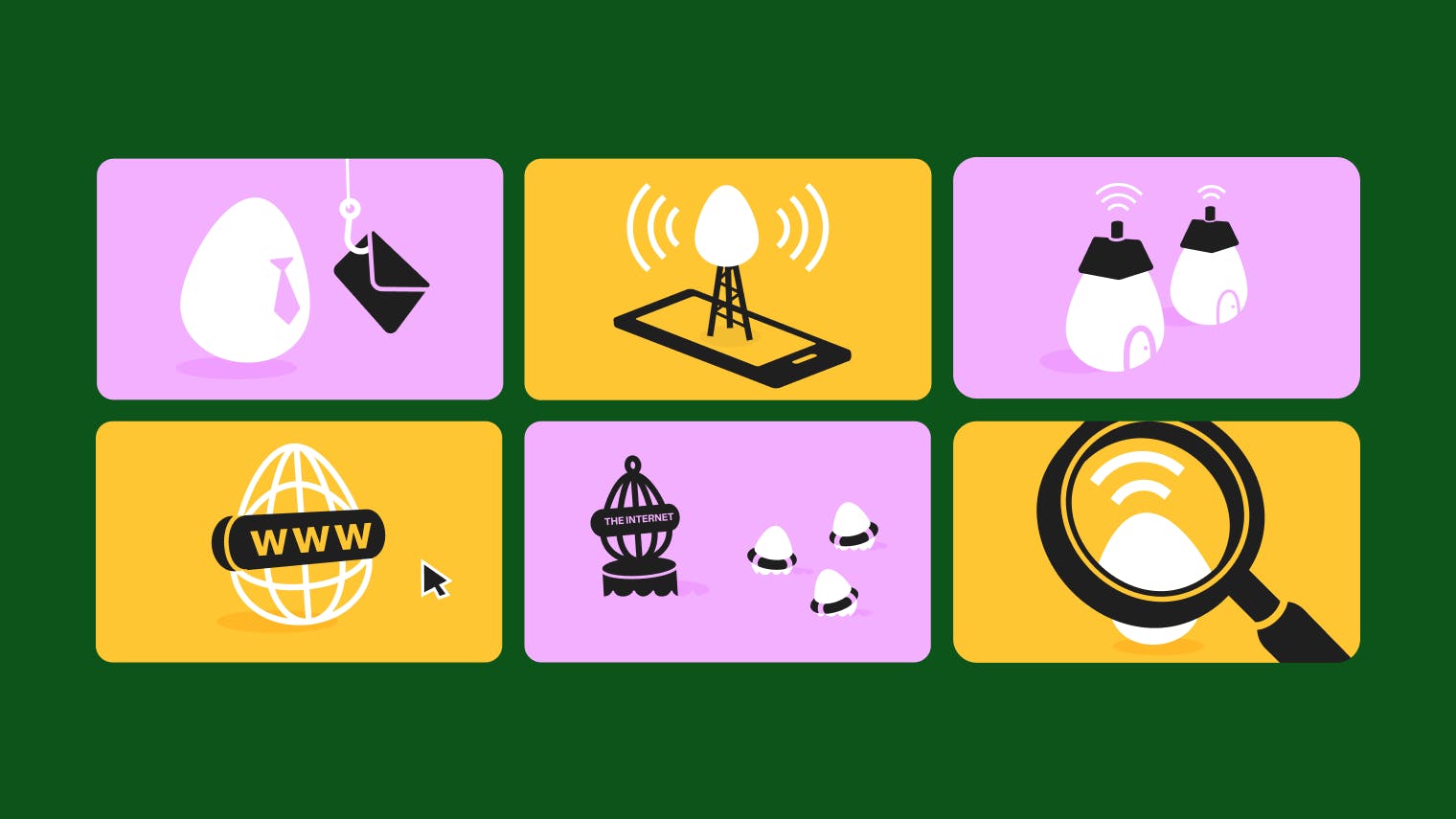
The egg is our distinctive brand shape, so we thought it was about time we really embraced this, especially in conveying different brand behaviours and emotions.
Together with Output we created seven distinct eggy worlds that play and evolve with their form and function.
From a brand POV, these animated eggs represent how frictionless and flexible Cuckoo is - whether it’s switching to us as your new provider, changing your speed or setting up new billing details – with a more-than healthy dose of that feel-good baseline.
And from an out-there-in-the-world POV, we just think they look really cool. Plus, they massively increase our scope for social media and marketing comms.
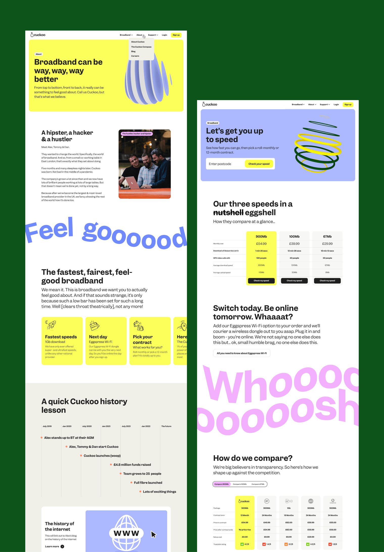
As I said, this was an evolution, not a rebrand. So yes, our primary colour is still Chris Martin’s favourite shade too.
It remains our unique-to-sector colour and one we still want to own. With the telecoms industry crowded with utility purples, corporate blues and drops of blood red, we’re still here to proudly stand out from the crowd.
That said, we have moved to a fresher, punchier yellow to further help us stand out in the market and convey a more premium and contemporary feel too. And to complement it, we’ve introduced a fresh pastel palette for our secondary applications.
A huge step for the new brand was the introduction of our new brand typeface, Garnett.
Striking the perfect balance between conventional type techniques and a digital-first typeface, Garnett rose to the challenge beautifully, delivering bags of personality and embracing our new brand character traits – all whilst demonstrating the attributes required by a modern typeface.
The introduction of Garnett also saw a change to our beloved logo.
Using the semibold cut as a starting point, each of the characters was redrawn – most notably the 'k' – to inject even greater personality and individuality in our most important asset. Redrawing the characters helped create something truly bespoke and unique to Cuckoo.
This new wordmark now posed a problem – the original rounded style of the egg no longer looked at home next to the angular and confident Garnett. So, using a selection of key character styles from the font as a reference, we reshaped it so to take on a more purposeful and typographic form representative of the new brand aesthetic.
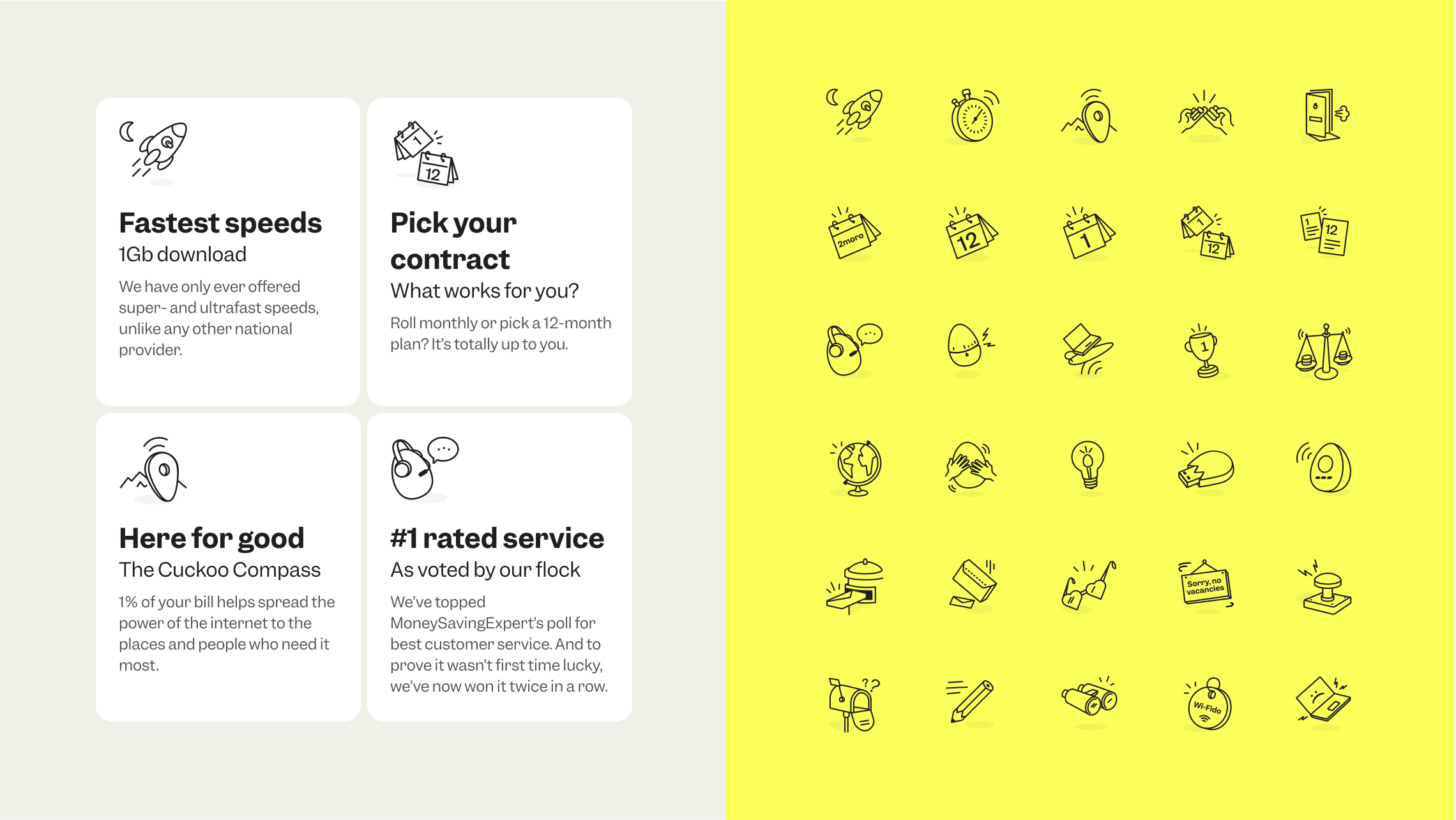
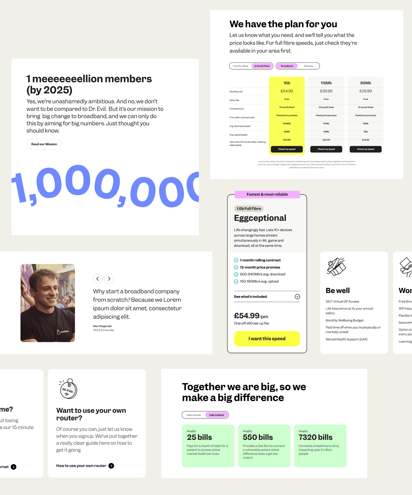
Another key component of the Cuckoo design system is iconography. Originally designed as somewhat of a hybrid, our library provided functionality whilst also injecting a sense of fun and character – mirroring the styling of the egg logomark.
However, the move to our new typeface Garnett and the refresh of the logo introduced a need to review these design principles. In doing this we took the opportunity to step back and assess the role of iconography as a whole across the new brand.
The result: two distinct libraries. A library of icons that'll you see throughout the core makeup of the website – such as tooltips and navigation – and our new pictogram library, which takes on a much more illustrative aesthetic – allowing us to crank up the warmth of our content in line with our brand character traits.
Further to the icons and pictograms, our Cuckoo guides delivered the perfect opportunity for a standalone egg-inspired illustration style.
Whether sign posting guides within the bustling content hub page, or packing serious – OK, not that serious – brand presence punch across social, these eggy editions inject personality and fun to important and perhaps ever-so-slighty-dry technical information.
I’m happy to confirm that working on this was equal parts challenge and enjoyment. A huge shout out to our incredible User Experience & Design and Technology teams who continually went above and beyond with their ingenuity, talent and diligence, but also to everyone else in the company who reviewed and commented on the work. It really was a full Cuckoo-wide effort, and I’m super proud of you all.
Big shout out to Output too. They are all of the superlatives and more - our partnership with them was goals. They brought us specialist skillsets and allowed us to work in true collaboration. If you’re looking for help on a refresh or rebrand, then call off the search, they are your people. 👊


But of course, we’ll be judged by what happens next, and how this brand evolution will play its part in making Cuckoo the UK's largest and most loved broadband company.
Lots of that will come down to what we say and do, and how we treat our flock. But having a more dynamic and distinctive brand will play a big, big part. Please cruise our website and socials to see it in action. Of course, if you want to feel the full effect, you’ll have to join the flock to understand why our customers rate us as highly as they do.
Read more on our brand refresh, from the folks who worked on it:
Al Hughes, Product Designer, on Introducing Yolk: our new design system
Rose Bowen, Frontend Developer, on Building our open-source design system
Ed Newton, Senior Designer, on Creating our key visuals: pictograms & illustrations [COMING SOON]
Hugo Bennett, Lead Copywriter, on (Re)defining Cuckoo’s Tone of Voice [COMING SOON]
A design system is a unified language that helps a team to solve problems consistently.
After being told by top London agencies it would cost upwards of £75,000 to develop our brand; we decided to embrace the challenge and keep it in-house.